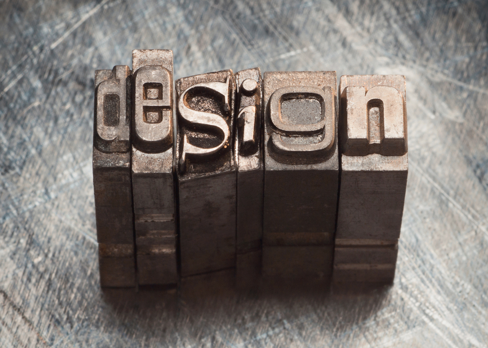
A picture may speak a thousand words but what about the words themselves? If you took the corollary of that statement to its ruthless conclusion you might think that the copy that accompanies your beautiful image is 1000 times less important, which, of course is not the case. And how those words are presented is a critical decision. The typeface, leading and font size are all vital to eking out every drop of meaning from your carefully crafted copy.
So, when you scroll down that list of fonts on a Microsoft Word document with those names like Apple Chancery and Palatino Linotype, think of it as stepping into a walk in wardrobe for words and picking out a nice suit to dress them in.
Decisions, Decisions!
The right font gives your words their visual tone of voice, whether that tone is serious, dour, frivolous or playful.Your words, your thoughts are going out there to make their way in the world. They are going to sink or swim in the morass of headlines, banners and paragraphs so you had better give them the best chance of being read, absorbed and even acted upon.
To Helvetica & Back!
Some fonts are designed specially for a particular product or brand. This gives the messaging a distinct and unique coherence. Although, a recent exercise showed that those bespoke fonts aren’t always so wildly different from the bog standard and freely available fonts at your disposal:
![]() Puma recreated using Helvetica Neue Condensed Black
Puma recreated using Helvetica Neue Condensed Black
The chances are, however, that you’ll have to go for an “off the rail” rather than a “bespoke” font and, if so, you need to give serious thought to which one is right for your business.
The right font – Discreet or Offbeat?
Well it all depends on your product, service or brand personality. There shouldn’t be a massive disconnect between your company’s tone of voice and the font deployed to carry that voice forward. Kooky fonts like “FEAST OF FLESH” are certainly eye catching and fun but perhaps not ideal for advertising some services:
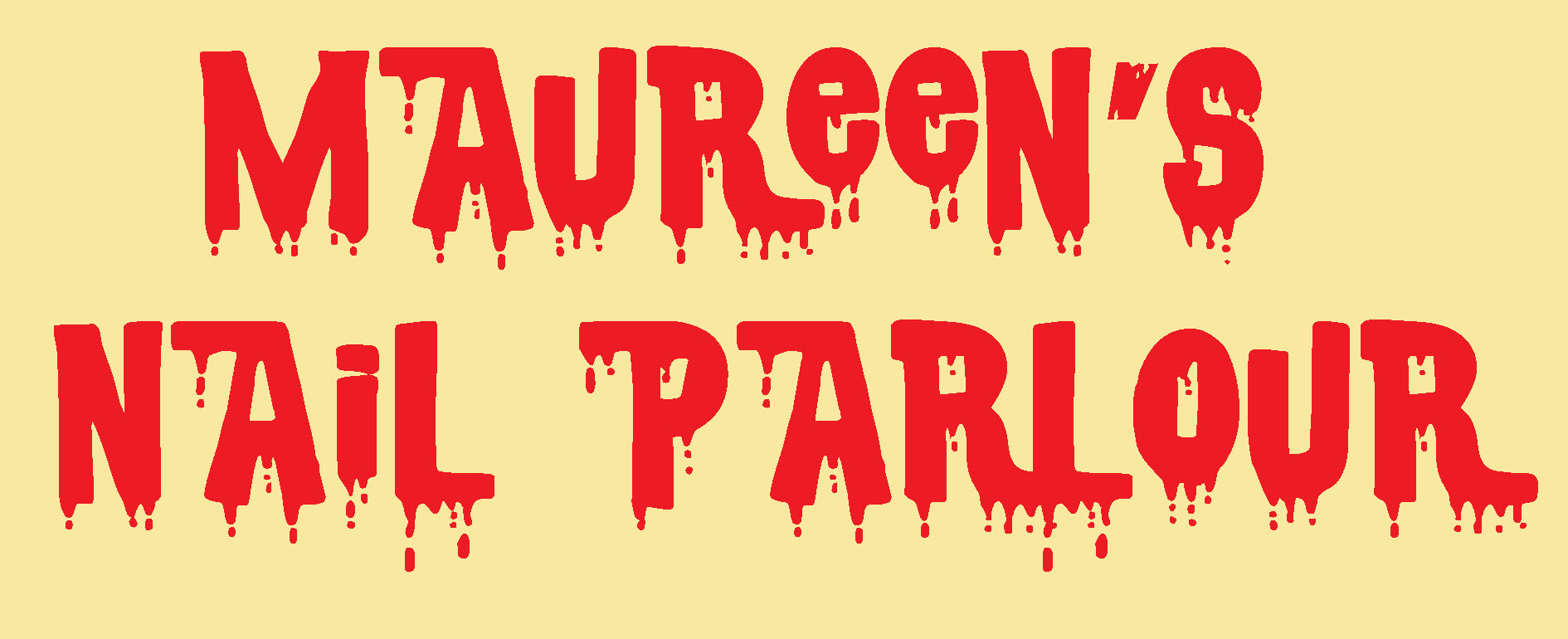
(‘Maureen’s Parlour of Horror’ might be more appropriate in this case. Not only is the font inappropriate, it gives the impression here that you’ll leave Maureen’s emporium dripping nail varnish all over yourself).
In the same way, the following typeface isn’t really an affective choice for an accountancy firm:
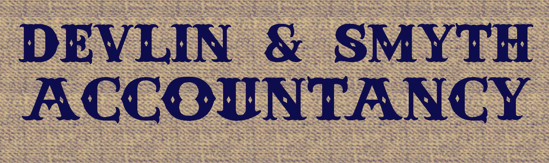
(This font could be justified of the accountants in question wore Stetsons and were armed with Colt .45s but in the leafy environs of Dublin 4 it would be less appropriate).
This isn’t to say that you need to always err on the side of the tried and tested. The right typeface is something that should co-exist with the tone of your communication. If it were respectful, sober and modest, then a less flashy ‘sans serif’ font would probably fit the bill.
If you’re advertising a loud, brash and outrageous event, then there is more freedom to experiment a bit.
So, remember… When you are choosing a typeface to compliment your sales message it needs to sit there effortlessly showcasing your carefully crafted words. Like a fussy referee making terrible decisions, the typeface should be unobtrusive and discreet so as to allow people to fully focus on the words and their meaning.
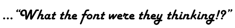
The last thing you want people to think when they hold your all-important flyer in their hands is…
And, of course, a good art director is the font of all knowledge when it comes to advising you on what typeface best suits your brands personality and character.
Simon O’Neill
Copywriter